

Photography
By Donovan
Why the can? Ive choosen to take all my photos without a portrait model of my classmates and instead use different cans of drink, this was a personal challenge of mine to see if i could keep to it and what i do with such a mundane object
This features all my work from are Wednesday sessions
All work here is done with a Canon 80D camera.
These sessins are done so we better understand how camera, operation and setting of a camera work and how to make them work for us.
Photography Exercise 1
Single shot
for the single shot techniques, we used a canon 80D to shot are photos, when taking these we had to use a single shot, meaning only one photo was taken and it was at a faster shutter speed, meaning less artificial light would be allowed in unless outside


Photography Exercise - 2 Depth of field
shallow depth of field photos


deep depth of field photos


For the shallow depth of field we had to lower the ISO and shutter to allow less light and have the shutter focus on one vocal point, This allows the camera to have its full attention on that one object or person and detail all of its features, this then allows for photos to not become cluttered with background noise if its of a certain building or a single person with a background of people, which could distract the photo
deep depth of field is when you can have a vocal point or no but still have the background in focus, this can work well with photos of nature if their are lots of one plant or trees, or of a cityscape.
With these photos I had fun taking them of the can, as having that as the focus was easier than having a person, who could be harder to work with for a beginner like me. I had praise on the architectural photos, as they were clean and had a clear idea of what it was going from, like the bannister one from below, having a crisp image of the banister itself, and the bike rack, being unique for its interloping circles, curve of the front bike rack and the far reach of the photo.


Sophia Rata is a Shallow depth photographer, she does a lot of commercial and editorial work for magazines and fashion brands
Her commercial work consists of fashion models, sport magazines and stock photos
most of her photography is studio based but she has done work with natural lighting. Her portraits of people are up close, unless its a group photo, although she will still have them all bunched up
Her Editorial work has it more up-close and personal,
with a lot of focus on face portraits, She uses a high quality camera
for these, giving them an aura of hyper-realism, she uses
a high ISO on these to make the background pop more against the bust and have the face not blend into the background
Charlie Waite - deep Depth photographer
Charlie is a nature/landscape photographer, he worked in the film industry before moving to full-time photographer, creating Britain leading photography workshop company, Light and Land
With this company he launched the Landscape photographer of the year
His photos are deep depth as they capture the tranquillity of nature, as well as the framing being perfected after years of doing it
i particularly liked this one of the trees, the a-symmetry of them and the colours popping made it very interesting to look at, the colours also having a sort of balance, the bottom having this field of yellow flowers, and the top having theses darker less colourful birch trees.
Sophia rata - shallow Depth photographer

i particularly liked this one of the trees, the a-symmetry of them and the colours popping made it very interesting to look at, the colours also having a sort of balance, the bottom having this field of yellow flowers, and the top having thses darker less colourful birch trees.

my own shallow Depth photography
i took these portraits of my cat, as I had nobody else in my house or nearby to take portraits of. I had trouble with them as the camera I had been given wasn't focusing properly, but i did end up with the result wanted, luckily my cat was willing to be still for the photos, i used a low F-stop to take these and a high ISO to make the room seem brighter than it was. I did the top one to mimic the Sophia one of the woman with only the front of her face and the rest off camera, though mine was facing a different direction and kept her neck in-shot, i


think the background being the almost the same colour as her fur makes her stand out a bit m ore, like she escaped the background to the forefront. I'm pleased with the second one as it was hard getting her to stay still and face forwards, but eventually I was successful, this one was mimicking the woman facing forward from Sophia, i purposely cut the top of her ears off so i could get closer to her nose without touching her, i really like how it got all the details on her nose and using a high ISO made her green eyes show more than if i used a lower one.
Overall im happy with how this photoshoot came out as i think i did it pretty well
Photography Exercise -3(a)
Shutter speed
High shutter speed


the high shutter speed photos were the hardest to work with, especially as I worked by myself, the can wouldn't stay still when i wanted it and rolled away when I wasn't tracking, i got help from 2 of my friends who were on break but still had trouble with the wind blowing it before either of us were ready
it was easier doing it when it was right in front of me though as the wind was blowing the from the side, getting the close up angle

Low shutter speed


with low shutter speed it was easier getting shots but harder to find what do with them, the first one was done my accident was i was trying to do high shutter speed but it think it still works, as its a different photo but taken the same way, showing how different each shutter speed is. I really like the second one and how everything besides the can is flat and sturdy, a sort of flash in the pan shot.
Photography Exercise -3(b)
Painting with Light

using a very low shutter speed and a very dark room, we used lights from out phone, and lightbulbs on a rope to make these photos. The camera was set at "6 shutters peed meaning they had 6 seconds to make a shape or anything with the lights, the effects made were these, as they had a such a short time, the things done with the lights aren't as impressive as they could be but it does show what can be done when given the opportunity
the second ones were more all over the place, and strangely managed to lighted the backdrop Aswell as capture the light painting, this shows how powerful this type of photograph can be, lightening a whole part of the picture that want before, by simply using the lights we were making
Photography Exercise -4
ISO and White Balance
white balance is the process of changing how a image colour is set, making it easier for the camera to pick up certain colours than others, if the shot is very yellow you can change the setting to focus less on the yellow and or another colour in the shot instead


White Balance & ISO photos


for white balance and ISO i decided to stick to what I've done this whole unit and use a can as a vocal point, messing with mainly orange/pinks when photographing it
i also took a lot of industrial photography, as lowering the WB and ISO brought out the grime and dirt of the construction site.
I like the first one a lot because the can fell right off as soon as I took the photo, making it a one time photo, one I could only take once.
I really like the ones i took of the buildings, the second one i used a purple WB and had the pole as the focus, making the bottom center to it looked appealing to the eye.

Photography Exercise -5
Composition
Negative space, Golden circle, Rule of thirds, Symmetry
Negative space is the practice of having a sole focus with a massive background with little to nothing in it, I accomplished this by placing a Can on a table, whilst having the wall of a budling behind it, not putting focus on the wall as to not bring out any of the details of it out, distracting people from the main focus, I took the photo from below, making it by itself in a massive white background
On the left is the correct way to do white space, as stated above, with the right behind the wrong way to do it, too much in the frame, not a clear focus on the target, too many different colours, as negative space should be limited to 2 different colours and subsets of those colours.
Negative Space


The golden ratio is a way of setting up a photo to have it fit a person way of viewing, starting from the top and gradually getting to an off-center point.
The golden ratio appears in a lot of things, it started at a mathematic way of mapping areas, but can be used in photography, modeling and art
I used it here in 2 separate locations, the left one is of a can in a greener bushy area, your eyes would start at the more detailed area of the bush and then look over at the can
in the second photo there is no point of contention to start at so it doesn't fit the golden ratio, there is too much going on and the focus point is way to off to the left to be fully matching the golden ratio.
Golden Ratio


Rule of thirds is a rule followed my photographer and filmmakers to make something in frame look appealing to the audience, there are nine boxes with lines separating them, the way they follow this rule is by having either the vocal point or an important part of the photo in-between these lines, so it keeps the person looking/watching's attention and allow them to add more in-depth things on the other points
for my rule of thirds I again used the can as a vocal point, the one on the left is one taken on a table, with a lamppost out of focus, whilst the can is still in focus, I used a low shutter-speed on this to make it darker and have the cans reflections pop more, this one is a correct use of thirds as the can is in the view of the audience and the lamppost is out of focus in the back
however, on the right is the wrong use of thirds, the can sitting atop the perch, the can is centered but has nothing around tit for the audience to grab onto and have it set in the background, making it a boring photo
Rulee of thirds


Leading lines are how a photographer directs a person's attention to a subject, either having them go right next to the subject or below/above the subject, they use these so that they can indirectly make something look more cinematic, either directing the audience to a dramatic part of the photo, or a connection point where something is happening.
For the one on the left i had it where the line was above the can, and besides, even without the line subtext this photo looks good, with the warm lighting as I had changed the WB to a higher more red colour.
The right one is a wrong example as it has too many lines around the photo, Aswell as the main focus one not being like the other tree behind it. I had also accidentally cut off the top of the tree making it look flattter and less open.
Leading lines


Symmetry
symmetry is when a photo can be cut down the middle and look like th other side, this is done for aethstic purposes, so a photo looks appealing and can create some photos to look big and pretty, setting up for shots like thee can be difficult though as it has to be completely the same cut down the middle
I did attempt this but not completely as i don't have a steady hand, so they ended up being tilted slightly,
With the one on the left i used a low iso and Shutter speed to make it darker, as it was under a shady part of the bike stand, this one is a good demonstration of symmetry as the pole in the center is good separation part for the symmetry to take place, i also like it as its like a meeting pint for the bike rack.
The one the left almost captures symmetry but doesn't as the background building is not symmetrical, as well as the pole not being centered
i did edit the image in photoshop to try and make it more symmetrical


Tatsuo Suzuki - Street photographer
More of his work
Tatsuo Suzuki is a street photographer who was born in 1965, he started taking photos in 2008, using a Niko D70
His photos are very stylistic, he chosen to have 1 person face quite close to the camera, either medium or very close, His genre is off street photography, and all of his photos are in black and white.
I like Suzuki's style as its doesn't try to change the place he taking photos in, quite the opposite as he describes his art as "taking photos of everyday people, even the less fortunate ones" making his photography very appealing to look at in my eyes, with the people not being dollied up for camera or any of the places being sets, he takes pretty much all his photos in Tokyo, Japan. He calls his style of photography "catching the decisive moment" a moment in which you cant predict and cant get by directing the photo. A majority of his photos are taken in a very high shutter speed with one focus on a character, i believe that his photos are edited in this aspect, where he take one photo of the focus in a low shutter speed then another in a a high shutter speed, mashing them together in a editing software, but he has yet to comment on this. His photos are in a black & white filter, giving it a darker vibe then most photos and keeping to the bleakness of the real world atmosphere his photos accomplish.
I like this photo done by him, it has the
focus on this older gentleman in a
crowd whilst everyone else is passing
him by, they're in a faster shutter speed
making them seem distorted and
unreconizable as people, as if its a
metaphor of sorts for the type of people
we see in a day, in the moment we care
what they think of us, but really we will
never see these people again. I also like
how Hes framed the it from above, but
still like your part of the crowd
Another thing i like about this is piece is
that the man in focus is the only one
wearing any type of white clothing,
making him more different from everyone else.
When i recreate his photography i want to do it in the style of his more abstract and less focus on the person photography, similar to the woman on the cross street, i like how it has a bright feeling but still has the bleak tones from the rest of his photos. He also manages to get light on
her face without using any studio or artificial light which i think
its impressive, especially for how candid they can be, i also like how
i also want to recreate some of his scenic photography,
like this one with the flowerbed, i like how sharp the photo is, focusing on one person from afar rather than close-up like in his usual photography, it also feels a lot less cluttered with only a bike and the bottom of a van being in frame, having total focus on the girl. It has a more general lightness to it, with less of a focus on black and more of a focus on the lighter tones.


My own photos - Street documentary
i made sure to take these on a moody, wet day to make it more in the style of Tatsuo
I have used a low iso to make them seem darker than they were. A problem i faced was that the camera i was given had no zoom on it making it harder for me to take phots up-close, making the ones i took look far away, this does work for the bottom one but lesser for the top one as during the editing process it made the faces seem warped and unintelligible, I fixed this by making the faces a separate layer annd it having its own B/W Layer
but that could've added to the effect as some off Tatsuo's photos involve faces being warped, but i didn't think it looked good as it was from afar.
i had taken it purposely with the bus in the background so i could change the brightness of the light the edit, making seem brighter than it was originally, i did this my simply using the burn tool around the light and using it around the light and on the floor, i realise now it looks curved at less forward focusing.

I like how this one came out, having her not be in the focus but still seen, i tilted the camera a little to take this photo to make the overhead things seem taller and more escalating then they actually are, i tried dialing down the inside lights but couldn't inertially mute the big round ones, making them seem distracting and out of place in a dark photo like this. I did also use a new layer to make her clothes completely black as they had patterns on them that could be distracting. I think the photos were pretty good for the time constraints I had on them, as the daylight was gone at this point as it was an overcast day, so i had failed at recreating his lighting, though i think i accomplished what i wanted with the first one


Engaging the viewer - Edward Burtynsky
ed Burtynsky is a contemporary photographer, born in Ontario in 1955 of Ukrainian descent, he grew up in Toronto and graduated from Toronto metropolitan university. He is heavily outspoken on pollution and a lot of his photography reflects that, in his own words he says, “my photographic depictions of global industrial landscapes represent over 40 years of dedication to bearing witness to the impact of human industry”. His development into photography started due to Early exposure to the sites and images of the General Motors plant in his hometown helped to formulate the development of his photographic work.
His art-work explores the natural beauty of are earth and the man-made faults of us as a species, he states that we all come from nature, so to destroy it without experiencing it is destroying ourselves, what his photography tries to accomplish is exactly that, giving us an experience to nature we wouldn’t get otherwise, but on the other side of the coin is his man-made landscape photography, this is when he shows are impact on this natural geography, and how, even if photogenic, is harmful and can lead to pollution and habitat loss.
In his photography he uses big-scale landscapes with a very deep depth of field, to get every detail in the photo and make it a bigger than life shot, all his photos also use a high shutter speed, making them look sharp and eye catching, with the brightest colours being highlighted, meaning that other colours are highlighted the photo that often get overlooked in photos, like dull yellows and oranges coming out to be brighter than they would be, this also means that you don’t get bored of the photo and dis-engage with it.
He uses natural lighting within his photos, only editing the ISO to make some photos seem brighter and warmer than others, like with his oil photos, separating the dirt landscape from the sun hitting the ground.
I like this birds-eye shot of salt plains, showing the destruction of a natural landform, and how everything moves on without replacement of the natural resources being taken from the earth, the top ones being this bluish green colour, whilst the bottom ones either being completely unused or this dirty, unfiltered yellow colour.
I like how has taken it from both sides giving
them equal amount of room in the photo, with the amount of
salt lakes being up the top, constating to the barren
landscape below of sand, dirt and tire tracks.
The use of a deep depths makes it so every detail in kept in frame,
every detail of the waters and salts, keeping the noticeable change of
the grey and yellow. The photo engages the viewer by having it be
quite mundane at first until you look at it for a extended period
of time, noticing how the salt plains are sampling being left
behind to rot and damage the environment. I like the fact every colour
is muted in tone, the harshes and brightest colours being the one
yellow pond, whilst the rest are all dull and ugly in colour, which i
think is on purpose to show how ugly pollution is and can be. The
photo uses his usual high ISO, high shutter speed sharp technique,
it being from above adds a sense of it being a massive part of land,
making it a big problem if you understand whats going on here, a
and even if you didnt the overall unappealing look of should
put people off it and make them want to know whats happening.
I also really like this one of the plane graveyard, a massive plot of dead-
land for unused and broken-down planes, who have supposedly been
sitting and rusting away for years, the amount of them depicted in this
photos show how bad its gotten, the fact these haven't been scrapped
and simply sit take up space that could be used for something more
useful shows how little care they had for these crafts and what happens
to them once they were no longer useful. The deep depth of field makes
this photo feel imposing and eerie in a sense, as these giant metal
beats all lined up in rows bring a lot of questions, like why are they
their? how did they get there? did how many are there? and where
is it?. The imposing mountains within the distance make a sort of
machine vs nature type photo, with the green's shrubbery being in the
back whilst we have this cut down, dirt patch of nothing filled with
rotting machines. The composition on this is eye catching, with the
pone plane being in the from, followed by two on the side as it gradually
expands to the open field of different planes, this techqiues makes
people look at the photo more to gather all the details, even with its
lack of bright colours, sticking with the natural lighting again, using the
high ISO to make the sun hit the ground harder and make the image
warmer.
This photo has a wider camera lens, this is to amplitfy the setting, a
tar black seabed with parts of machinery, broken metal and people hauling
it along the sand. The lighting here is dull and overcast, he doesn't use a high
ISO in this imager, rather keeping in lower to bring out the grey and keep the
seabed a gross black colour, though he does use a deep depth of field
so we can see all the detail of the a foreboding mist reeling in with a ship sitting
in the back, a sort of mirage of what used to be where the parts of machinery lie.
this photo has a natural black and white to it, thanks to the shadow work and the
time of day he took it, it has a bleak sense of finality to it, like this is a photo from
a bleak future where nothing got better.
the small details matter in this one, the more you look the more you see, at first
glance you might miss the people pulling the machinery across, this i think is on
purpose, to show how powerless we are against are own mechanical progression,
as we have no way of environmentally friendly getting rid of these metal beast
once they serve us no purpose.
this is one of the more blatant pollution images he has, showing the effects
of ship breaking in the open, the residue of industrial progression is the message of a lot of his photography, as these things age so do
This one is taken from above but points forwards, using a lower than usual ISO
not untypical for him but he also uses a natural lighting, as to not make any of the
already bright looking rocks outshine each other. The setting for this photo is a
rail-line stretching over a blasted-rock face, the focus is on the ripples of rock
above the engine and its train. He uses a low shutter-speed here, not enough to
blur the engine but enough to make it look like its moving with speed, a force of
machinery passing through a manmade rock-face. The photo evokes a sense
of claustrophobia, a feat as the photo is taken from what is presumed miles away
and high up, your made to stare at a part of land you probably overlook in your
day to day life. The photo having this focus may make you overlook the trees
surrounding the cliff, as how unevenly spaced they are, as the line gets closer to the
tunnel the trees stop being as big and as frequent and start to become simple shrub
and bushes. He manages to make the rails itself a sort of center point, without
having them high up and more to the ground level of the photo, allowing are eyes
to focus more on the rocks, as that's what i think he was trying to do anyways
with this, having us look at the destruction of nature, but this time a necessary one
as without rail travel business and people will go without essentials,
Engaging the viewer Mood board
Experimental shoot plan 1 -
For my experimental shoot i want to replicate his "homestead" photography collection, as it would be the easiest to do with my limitations
for this i will travel to small towns around my area and take photos from above, trying my best to replicate his angles and sharpness of photos, using a tripod and canon 80D.
for these photos i will go to places like national trust and the many large landscapes around cornwall. Itll have to use the natural lighting of the place i choose, i probably wont be abl to capture the high lighting of his photos as the weather is overcast and rainy the dqys i am taking photos.


experiemental photoshoot 1
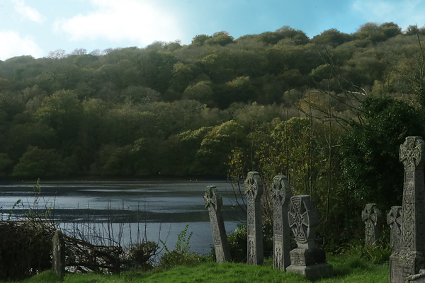
For this experimental photoshoot i had a lot of problems with it, as the first place i wanted to i go to take photos was closed, so had to improvise the place and instead went to the church Apon the estuary, im not exactly pleased with what i got as it doesn't truly replicate Edward Burtynsky style but i did try with the massive landscapes and message of climate, i had no real way of getting massive shots from above so i had to settle with standing on a bench atop the hill, which i think does a good job of creating a big perspective. i think the estuary photos came out a bit blurry as i didn't use the right depth of field, making them blurry but i will fix this with the edits, i also want to make them sharper and less grey, the weather was dark and dreary all day and didn't create a good natural light to use, besides the few light spells we had.
I think i like the bridge one the most, i was trying to capture the claustrophobic nature of some of his homestead work, for all the photos i used a find depth of field and slightly high ISO, especially on the bridge one. i tried to capture his claustrophobic feel of some of his work, making the viewer feel as if they're on the bridge themselves about to walk into another place With the edits they'll mostly be atheistic as i want to make them more vibrant and colored.
Unedited photos from shot
For my mood board i chose to go for a more setioned approach, havign certain parts for certain parts of the mood these photographers go for, and what they choose to take photos of, like for iconography i leant towards the bigger themes in this type of photography, like polution, nature and the capitalism. Then for the photos i chose to include i used alot of the bright high ISO photos, as thats what they tend to use.
something i do see alot of people do is choose wording that describe the mood they go for, i used to this alot in media classes so it though i'd fit if i also did it here, also adding a colours section for what colours i see the most from these photgraphers


Edited photos

for the edits here i did simple lighting changes, using colour range to select the colours i wanted to enhance, and creating a hue/vibrance layer to enhance them, im impressed with how the sky turned out, a originally the overcast was completely grey, i did have to do small changes to the trees as it had accidently turned some of them blue aswell, but this was simple to fix as i just had to erase around the trees, i also added some vibrance to the grass, making it less dead. For the first photo i didn't like the grave on the ground as it cluttered up the photo, so i clone stamped it out, i had also cloned stamped out the boat mast from the second photo, and from the bridge i clone stamped out the hut that was sitting on the edge.
Engaging the viewer - Saul Leiter
The late Saul Leiter is one of the early pioneers of color photography, born in Pittsburgh in 1926, he started out as a painter and attended Cleveland, this was until he met an abstract painter called Richard Pousette-Dart, who at the time had was experimenting with photography, this led Leiter to pursue a path in photography, in 1949 he experimented with using out of date kodak film, creating a grungy feel to his photos, he mainly did street photography as this time, taking photos of the world around him, he had a philosophy that was “I happen to believe in the beauty of simple things. I believe that the most uninteresting thing can be very interesting.” His photography demonstrates this, with his abstract framing of the camera capturing some thought-provoking scenes. He has a painter image in mind when taking photos, the composition of the shot is up close, especially in his portraits and often used a shallow depth of field focusing on a certain vocal point for the audience to think about, as well as having high exposure, especially in his color photos. He also took photos of his small group of friends, putting them in the foreground as something interesting happening around them. He became a predominant name after appearing in the Always the Young Strangers art exhibition in the museum of arts, putting in name out there as a photographer who isn't afraid to show the world as it is. His photos tend to deal with everyday life, photos from a window still viewing down to the people below or just the view from outside a window, crating an outsider perspective to whatever is occurring on the other side. Leiter's photography seems to be completely unedited, as they were taken on film it wouldn't be possible to edit them, unless it was to up-scale them for a modern audience.
I chose this photo as its really interesting, from afar it seems to be a normal woman leaning on a car, but its actually a mannequin, its an interesting photo for sure as their isn't any context to why the mannequin is there. The photo itself it set an in a depth of field but from separate places, as the front is out of focus Aswell as the behind of the mannequin. I like how cluttered the photo is, giving it a claustrophobic feeling, akin to what Edward burskys does with his but in this case its more relatable. This phto to me conveys a message of fake beauty, the mannequin dolled up and wearing this extravagant coat whilst leaning on a neat tidy coat, but she herself is overshadowed by this unknown man, almost a metaphor for how woman were treated back then, as simple items to show of, often forgotten about and left to be stared at, almost like they themselves are seen as cars. The use of color here is also interesting, as the photo has a heavy usage of green, the cars are green the coat is green and the door is green, this is almost definitely accidental but it fits the message i think this photo is trying to convey, as green is seen as a colour of money and greed, something to be shown off and praised, almost in the same vain as woman were seen to be back then.
this photo uses a window for its key feature, i like the depth of field in this photo, the haircut sign being the thing most in focus but your most drawn to the guy in the centre, seemingly staring at himself through the window, the colours here are vibrant but at the same time they're dull, and dirty, capturing the mundanity of life. I like how you can see only half the guys face from the reflection, as if the message is giving off that the guy doesn't recognize his reflection, be in it in a general sense as he probably has just had a haircut, or in a more metaphorical sense, that has lost himself over the years and forgotten what he truly is as a person. i again like the claustrophobic nature of this photo, and how the natural lighting makes the photo feel warm, almost inviting, its the type of photo that you would see on a poster somewhere. The photos composition is hard to get your head around, almost as if Saul was standing half inside a door and half out half in to get the window reflection to appear on the camera, to get the reflection to appear at all you would have to set it at a high ISO, which adds to the overall warmth of the photo. the haircut sign being forefront brings people to engage with the photo, as the colours are inviting and recognizable, even if people don't know where they know it from.
this is one of my favrioutes ive seen by him, the composition alone make it an interesting piece, it leaves you asking a lot of questions, one being how did the car get smashed? is their something signification to it? does it correlate to the other cars around them?. The shadow work here is nice as well, the carness from inside the smashed car making it unclear what's actually inside of it, as the ISO seems to be quite low for this photo. I like how he shot this with the old guy i the frame of the cracked window, whilst the younger man is on the other side of the frame, a meaning that could be taken away from this is the passage of time, as if the crack resembles the scars of life that people go through as they get older. This photo is one of the few has taken in a deep of depth of field, this is probably to capture the rest of the street and its cars, adding to the scope of the photo.
this photo is one of his taken in a high shutter speed, the outfits the three people are wearing are synomous with Mafia type characters, creating a feel that this photo shouldn't be viewed, added with the vagueness of where they are as the shadows cast behind them obscuring any type of building to be seen, also with the added noise around the photo making some facial features obscured. The lighting here is also darkly lit, making the scene feel like its at night, probably because it was. the people around them feel like extras to a event thats about to happen, theyre faces are not shown covered by hats or them being rarely seen off screen
Experimental shoot plan 1 -
for my experimental shoot plan i want to got to one of cornwalls many ghost towns, somewhere lke redruth or liskeard, this way i get photos like the mannequin and cracke glass one, , it can also add to the effect of mudane life, and can have some creative shoot ideas. Ill use th weater to my advanatge and try to take 2 photos to change into black and white and then 2 for his colour photos, ill have to use a different lens for those and have the camera be on its side for every photo, that seems to be a constant theme in his photos, making them seem bigger. The lighting may not matter for the B&W ones but for the colour ones i may have to edit the lighting alot to make it match, ive learnt since my editing for edward burtsyk photos how to change the lgithing to make it more vibrant, so it better matches the photographer im copying.


experiemental photoshoot 2
This photoshoot went better than the first, it was a lot simpler and getting the photos was easier, we ended up going St. Ives as it has a lot of narrow alleyways and people walking around, this made some of my photos seem quite packed with too much going on to use, but a lot of them in the quieter parts were good and usable, i had asked to use a high vocal length lens, this being my first time using a different lens, it was the high vocal length lens, the lens was really useful with this as it made focusing things in and out of frame easier has quite heavy and made using the tripod a bit difficult as it would constantly weight it down making it hard to tighten it properly. I found a pretty nice place to take photos of down near the side of the pier, i found this house that had an interesting photo on the side, the house was abadonded and has some weird stuff all around it, what intrested me the most was the before mentioned drawingt of a guy, it seemed to be written on some fiberwood, it reminded me of Sauls photo of the guy within the cracked glass, i also tride replicating his out of focus background stuff going on with the plastic bottles overflowing.
Unedited photos from shot


Edited photos
With these i kind of went all over the place with edits, for the black and white ones i simply edited them and changed the hue and saturation to make them alot more darker that bright, this helped with the blue on the pringles can become dark rather than white, also with the prignle can photo i edited the gu in the backs bag, to make ti a solid colour instead of 2 speerate shades of brown
i went a chaotic with the bottle one, duplicating the bottles using the quick selection and creative a massive spiral hole in the wall with a dog in the centre, with comedic purposes
i also changed the over side of the wall to a massively satured and pink area, no real message behind this other than, i thought it looked nice


Engaging the viewer -John Clang
John clang is a photographer, his photos are highly edited pieces of work, usually street photography, but he does do conceptually normal pieces
John clang was Born in Singapore in 1973, he started doing art and photography to absorb the mudane and extranal stimuli to convey his messages, i may not understand what this means but its his words
he went to a art exhibition at age 20, this being the first time he presented his work to the world, he went on to solo an art exhibition at Jenda gallery in Singapore
His art has entered the Singapore art museum and art collection, a big achievement in any artist career
as stated before, his art captured the mundane of life and puts an often emotional spin on it
their isn't a lot on Clang as he keeps a lot of his life private, to this will be the smaller out of the bios on artists
his style is one of fluxuation , sometimes having high iso and low exposure, then other times like his sansface collection having high iso and exposure, though all his works involve people and faces.
his photos are all edited or have some type of aritstic twist to them, some having whole parts of it cut out and repleaced with other times of the day and some having the faces covered by solid blocks
experimental photoshoot plan 3
i plan on going back to st. Ives as it proved to be a good place to take photos, aswell as really busy and good for street photos of people
ill bring a 55mm lens to help focus on the people i want to take photos of
ill specificlly be taking photos in style of his "sans the face" "guilt" and "remebering starngers" as i will edit all three into 1 of these styles. Ill need to expermient with iso and exposure for these to mimick his style

Edited photos
with these i mainly focused on how I would edit them when taking them, the seagull one was made to mimic one of this photos but with a twist, instead of using a human model I used a seagull, this was an easy edit as all i needed to do was add a squares over its face, the second one was fun to do, masking over the people and adding a phrase that has that fake edge to it "true love is" and then copy and paste it over and over again
the bottom one was more of a experimental thing, as Johnny himself hasn't done photos like that but i though it was in his style to cut someone out and draw over them


